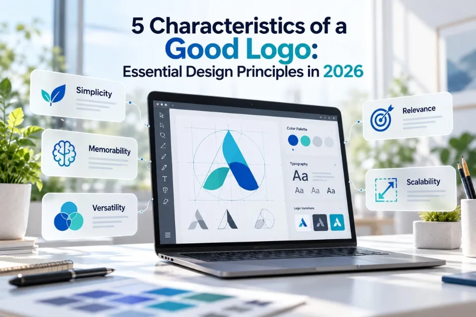
A good logo is simple, memorable, timeless, versatile, and appropriate for the brand it represents. These five characteristics help businesses create a recognizable visual identity that works across websites, mobile applications, social media, printed materials, and physical products.
In 2026, effective logo design requires more than attractive colors or typography. Logos must remain recognizable on small screens, adapt to different backgrounds, and support a consistent brand identity. Artificial intelligence can also help designers explore creative directions, but human judgment remains essential.
Whether you are launching a business, refreshing an existing identity or studying graphic design, understanding the five characteristics of a good logo provides a practical foundation for making informed design decisions.
What Makes a Good Logo?
A good logo communicates a brand’s identity clearly, distinguishes it from competitors, and remains effective across different applications.
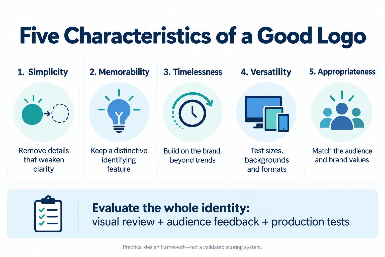
The five foundational characteristics are:
- Simplicity: A clear design without unnecessary visual elements.
- Memorability: A distinctive identity people can recognize and recall.
- Timelessness: A design that remains relevant beyond temporary trends.
- Versatility: A logo that works across sizes, formats, and environments.
- Appropriateness: A visual identity that reflects the brand and its intended audience.
| Characteristic | Why It Matters | How to Evaluate It |
|---|---|---|
| Simplicity | Improves visual clarity | Test at small sizes |
| Memorability | Supports brand recognition | Conduct recall tests |
| Timelessness | Supports long-term consistency | Assess trend dependence |
| Versatility | Enables cross-platform use | Test different formats |
| Appropriateness | Reflects brand positioning | Gather audience feedback |
These principles work together. A visually simple logo may be easy to reproduce, but it also needs sufficient distinctiveness and relevance to represent a particular organization.
The Five Essential Characteristics of a Good Logo
1. Simplicity: Keep the Design Clear and Recognizable
Simplicity is one of the most valuable logo design principles because it helps audiences identify a symbol without processing unnecessary details.
An effective logo uses carefully selected shapes, colors, and typography to communicate a recognizable identity. Decorative elements should support the design rather than compete for attention.
Simple logos also tend to reproduce more effectively at smaller sizes, where detailed illustrations and thin lines may become difficult to distinguish.
Consider the Nike Swoosh. Its distinctive curved shape can be recognized without requiring the company name beside it. However, that recognition also reflects decades of consistent marketing and brand exposure.
How to achieve simplicity
- Remove details that do not contribute to recognition.
- Use a clear visual hierarchy.
- Limit unnecessary decorative effects.
- Choose typography that remains readable.
- Make effective use of negative space.
Simplicity should not be confused with minimalism for its own sake. A logo can include several elements when they serve a clear purpose.
Practical test: Display the logo at 32 × 32 pixels and in black and white. Check whether its essential shape remains identifiable.
2. Memorability: Create a Distinctive Brand Identity
A memorable logo helps people recognize a business when they encounter its products, advertisements, or digital platforms.
Distinctiveness is particularly important in competitive industries where many organizations use similar colors, symbols, and typography.
For example, the Apple symbol uses a recognizable silhouette that can operate independently of the company’s name. Its distinctive shape supports identification across products and digital interfaces.
However, memorability does not depend on graphic design alone. Brand exposure, customer experiences, and repeated encounters contribute to familiarity.
An unfamiliar logo cannot reasonably be expected to achieve the same immediate recognition as one used consistently for decades.
How to improve memorability
- Develop one identifiable visual feature.
- Avoid copying competitors’ design conventions.
- Use shapes or typography that reflect the brand’s personality.
- Maintain visual consistency across marketing materials.
- Test whether people can distinguish the logo from alternatives.
Practical test: Show several potential logos to participants for a short period. Later, ask which designs they remember and what brands or qualities they associate with them.
Record the results rather than relying entirely on the designer’s personal preferences.
3. Timelessness: Design Beyond Short-Term Trends
A timeless logo is designed to remain useful as marketing trends, devices, and visual preferences change.
Fashionable gradients, complex effects, or popular type styles may look contemporary at launch but can become dated when those trends disappear.
Timelessness does not mean that a company must preserve its logo permanently. Many successful organizations refine their identities to improve readability, address new technology, or reflect changes in business strategy.
The Coca-Cola script is a useful example of a longstanding visual identity. Although its presentation has evolved, its distinctive lettering remains central to the brand.
Effective timeless logo design generally begins with clear brand positioning rather than attempting to predict future graphic design trends.
How to create a lasting design
- Prioritize recognizable shapes over fashionable effects.
- Choose typography suited to the brand’s identity.
- Avoid unnecessary stylistic complexity.
- Develop a coherent visual system.
- Assess whether the design will remain practical as platforms change.
A modern logo should support future adaptation without losing its essential identity.
Practical test: Remove fashionable textures, gradients, and decorative treatments. Determine whether the basic design still communicates the intended identity.
4. Versatility: Make the Logo Work Everywhere
Versatility describes a logo’s ability to remain effective across different sizes, backgrounds, materials, and digital platforms.
A business may use its identity on a website header, mobile application, social media profile, invoice, business card, uniform, or outdoor sign.
Each application introduces different technical requirements.
A detailed horizontal logo may work well on a desktop website but become unreadable inside a small social media avatar. A responsible design process therefore considers multiple versions rather than forcing one layout into every context.
Responsive logo design
Responsive branding uses coordinated variations of a logo for different viewing conditions.
A brand may maintain:
- A complete logo containing the symbol and business name.
- A compact horizontal or stacked version.
- A simplified standalone symbol.
- Light and dark background variations.
- A monochrome version for limited-color applications.
These variations should preserve a consistent visual identity.
Choosing the right logo file format
| Format | Best Application | Main Consideration |
|---|---|---|
| SVG | Websites and scalable graphics | Vector-based; supports sharp resizing |
| PNG | Transparent raster logos | Resolution-dependent |
| WebP | Optimized website images | Raster-based; supports transparency |
| Print and design handover | Can preserve vector artwork | |
| AI or EPS | Professional design and production | Editing support depends on software |
Vector artwork is particularly valuable because it uses mathematically defined paths rather than a fixed pixel grid.
Adobe’s official logo design guidance recommends vectors for artwork that needs to scale from small printed materials to large displays. See Adobe’s logo design guide.
Practical test: Review the logo on a mobile screen, website header, social media profile, printed business card, and monochrome document.
If the artwork becomes unclear, develop appropriate variations without changing the central identity.
5. Appropriateness: Reflect the Brand and Its Audience
An appropriate logo communicates qualities consistent with the organization’s purpose, positioning, and audience.
A children’s educational organization may benefit from an approachable visual style, while a financial services company may prefer a more restrained identity.
Neither direction is universally correct. The appropriate choice depends on the specific organization and the expectations of its audience.
Typography, color, imagery, and composition contribute to these perceptions.
For example, a playful handwritten typeface may be suitable for a creative workshop but less appropriate for a formal legal practice.
Cultural considerations also matter. Colors, symbols, and imagery can carry different associations across regions, so international brands should review designs with their intended markets.
How to assess appropriateness
- Define the brand’s values and personality.
- Identify the intended audience.
- Review the competitive environment.
- Test typography and imagery in realistic applications.
- Obtain feedback from representative users.
A logo does not have to illustrate the product or service literally. A technology company does not necessarily need a computer symbol, and a bakery does not need a picture of bread.
Practical test: Ask intended customers what qualities they associate with the logo before revealing the company’s positioning. Compare their responses with the desired brand identity.
How Logo Design Has Evolved in 2026
The five traditional characteristics remain useful, but modern digital environments introduce additional practical requirements.
Digital-first and mobile-first branding
Customers increasingly encounter brands through search results, mobile websites, applications, and social media platforms.
Logos must therefore remain identifiable in restricted spaces where complex artwork becomes difficult to reproduce.
A simplified brand mark can be more effective than a full company name in a small icon, provided the symbol has sufficient recognition.
Light and dark mode compatibility
Digital interfaces frequently switch between light and dark appearances.
Designers should prepare suitable logo variations to maintain visibility and preserve the intended brand colors.
Accessibility and visual clarity
Accessibility is another important consideration.
The Web Content Accessibility Guidelines (WCAG) 2.2 provide guidance on contrast and perceivable digital content. Logos and logotypes have specific exemptions from certain contrast requirements, but readable variations remain good design practice. See W3C’s contrast guidance.
Supporting website text, buttons, and other interface elements must be evaluated separately against the applicable accessibility criteria.
Designers should also avoid relying exclusively on color to communicate important information.
Motion and animated logos
Motion can extend a brand’s visual identity into video, application introductions, and digital campaigns.
Animations should remain consistent with the original design and account for users who prefer reduced motion. W3C’s interaction animation guidance addresses disabling nonessential interaction-triggered motion under WCAG 2.3.3, a Level AAA criterion.
Animation is an optional application of a logo, not an essential characteristic of a good one.
AI Logo Design in 2026: Opportunities and Limitations
Artificial intelligence has introduced additional ways to explore logo concepts, typography, and visual identity ideas.
AI image-generation systems and design platforms can assist with brainstorming, creating visual references, and producing alternative concepts.
For context, see the AI image guide.
However, producing an attractive image is not the same as developing an effective and legally usable brand identity.
AI-assisted versus traditional logo design
| Consideration | AI-Assisted Design | Professional Human-Led Design |
|---|---|---|
| Concept exploration | Rapid initial variations | Research-led creative exploration |
| Brand positioning | Depends on the brief and review | Can incorporate stakeholder research |
| Typography | May require correction | Direct typographic control |
| Originality | Requires independent checks | Also requires originality checks |
| Production files | May need vector rebuilding | Can produce controlled vector assets |
| Final approval | Requires human evaluation | Requires human evaluation |
AI can be helpful during early exploration, but generated concepts should be reviewed for similarity to existing trademarks, production quality, and relevance to the intended audience.
Legal considerations deserve particular attention.
The U.S. Copyright Office’s January 2025 report explains that copyright protection for AI-generated material depends on sufficient human-authored expression. Prompts alone do not necessarily establish copyrightable authorship. See the Copyright Office report.
Trademark rights are a separate issue. The USPTO recommends comprehensive searches for conflicting marks before filing a trademark application. See the USPTO clearance guidance.
A responsible AI-assisted workflow therefore includes human refinement, vector preparation, originality screening, and final brand testing.
A Prompt for AI Logo Exploration
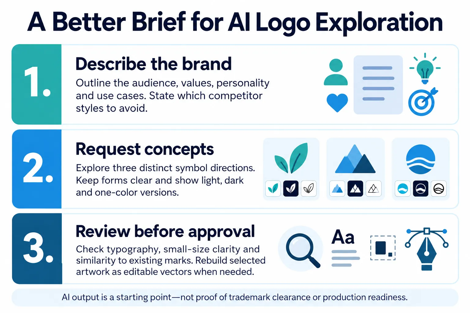
Explore three distinct logo-symbol directions for a brand with [audience], [values] and [personality]. Its main uses are [applications]. Avoid [competitor styles]. Keep the forms clear and show light, dark and one-color versions. Explain how each direction supports the brief. Treat the results as concepts requiring typography review, independent similarity checks and editable vector preparation.
Replace the bracketed details with a real brief. Compare the outputs against the five principles and review them with representative users before approval.
Common Logo Design Mistakes to Avoid
Even visually attractive logos can perform poorly in real-world applications.
Common mistakes include:
- Excessive complexity: Detailed artwork becomes difficult to reproduce at small sizes.
- Generic symbols: Overused icons make it harder to establish a distinctive identity.
- Poor typography: Decorative lettering can reduce readability.
- Trend dependence: Fashionable effects may quickly appear dated.
- Inconsistent versions: Uncontrolled variations weaken brand consistency.
- Low-resolution files: Raster-only artwork creates scaling limitations.
- Poor background compatibility: Logos can disappear against unsuitable colors.
- Insufficient originality checks: Similarities to existing brands may create legal and commercial problems.
The best corrective approach is to evaluate a logo as part of a working identity system rather than judging a single presentation mockup.
How to Evaluate a Good Logo: Practical Checklist
Worked Example: Logo Versatility
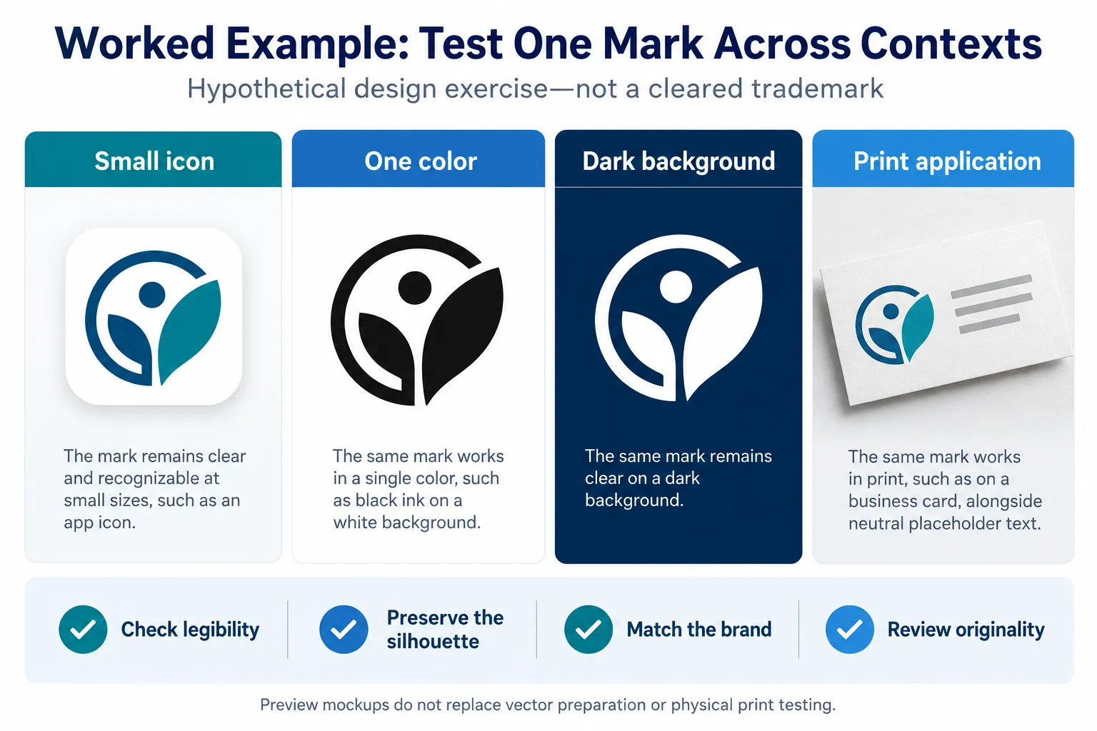
Use the same underlying mark in each context and record what changes. Test actual exported files at their intended display sizes; the mockups illustrate the process rather than establish a minimum-size standard.
Before approving a design, test the five core characteristics and the additional requirements of modern branding.
| Evaluation Area | Practical Question |
|---|---|
| Simplicity | Is the design understandable without unnecessary details? |
| Memorability | Can intended users recognize or recall it? |
| Timelessness | Does it depend heavily on temporary trends? |
| Versatility | Does it remain usable across formats and sizes? |
| Appropriateness | Does it reflect the organization and audience? |
| Accessibility | Are relevant logo variations visually clear? |
| Originality | Have relevant trademark and competitor searches been conducted? |
| Consistency | Are approved versions documented in brand guidelines? |
This checklist is a practical professional framework, not a scientifically validated scoring system.
For an informed decision, combine design reviews with audience feedback, technical testing, and appropriate legal checks.
Real-World Examples of Effective Logo Design
Several established identities illustrate how the five principles work in practice.
Nike: Simplicity and Recognition
The Nike Swoosh demonstrates how a distinctive visual shape can become closely associated with a brand through consistent use. See Nike’s Swoosh history.
Apple: Memorable Visual Identity
Apple’s silhouette provides an example of recognizable symbolic branding that works on devices, packaging, and digital interfaces.
Coca-Cola: Timeless Visual Character
Coca-Cola’s distinctive script illustrates how a brand can maintain familiar visual elements across changing marketing environments. The company’s brand history describes the script’s origins.
FedEx: Typography and Negative Space
The FedEx wordmark uses typography and a directional arrow formed within its letter spacing, demonstrating deliberate use of negative space.
Mastercard: Versatility
Mastercard’s overlapping circles provide a recognizable symbol that can be adapted to applications where the complete wordmark may not be practical. See the Mastercard symbol announcement.
These examples demonstrate design principles rather than prove that any single visual feature caused commercial success. Recognition also develops through marketing, distribution, customer experience, and repeated exposure.
Frequently Asked Questions About Good Logo Design
1. What are the five characteristics of a good logo?
The five characteristics are simplicity, memorability, timelessness, versatility, and appropriateness. Together, these principles help create a logo that is clear, recognizable, durable, practical, and aligned with the organization it represents. A successful design balances all five rather than concentrating exclusively on visual attractiveness.
2. What is the most important characteristic of an effective logo?
There is no single characteristic that is universally most important. Simplicity can improve clarity and usability, while memorability and appropriateness help communicate a distinctive brand identity. The right balance depends on the organization, its audience, and the environments in which the logo will appear.
3. Why is simplicity important in logo design?
Simplicity helps a logo remain clear when displayed at different sizes or reproduced in different materials. Removing unnecessary elements can improve readability and reduce production difficulties. However, simplicity should not eliminate the distinctive visual features that help customers identify the brand.
4. What makes a logo memorable?
A memorable logo combines a recognizable visual element with consistent brand exposure. Distinctive shapes, typography, and composition can support recognition. Familiarity also develops through repeated encounters, so a newly introduced logo should be evaluated differently from a long-established brand symbol.
5. How can a logo remain timeless?
A logo is more likely to remain useful when its design reflects enduring brand characteristics rather than temporary decorative trends. Clear typography, purposeful visual elements, and a consistent identity system can support longevity. Even timeless logos may require careful updates as technology and business needs change.
6. What is the difference between a logo and brand identity?
A logo is a visual identifier, often combining a symbol, wordmark, or both. Brand identity is broader and includes typography, colors, imagery, layout, design guidelines, and other elements that create a consistent presentation. The logo is one component of this larger system.
7. Should a professional logo work in black and white?
Yes, testing a logo in black and white is a useful way to assess shape, contrast, and reproduction quality. Although some identities rely strongly on color, a monochrome variation can support printing, engraving, and other restricted applications. The essential design should remain understandable where practical.
8. Can AI create a professional logo in 2026?
AI can generate useful logo concepts and assist with visual exploration. However, professional use requires additional review for originality, trademark conflicts, typography, scalability, and brand relevance. Designers may need to rebuild AI-generated artwork as editable vectors and refine the final identity through human-led decisions.
9. How do you test whether a logo is effective?
Test the logo across realistic sizes, backgrounds, and formats. Ask representative users about recognition, readability, and brand associations. Review its distinction from competitors and check production requirements. Combining audience research, design evaluation, and technical testing provides stronger evidence than relying on personal preference alone.
10. What mistakes should businesses avoid when designing a logo?
Businesses should avoid overly detailed artwork, poor typography, generic symbols, low-resolution files, and excessive dependence on design trends. They should also avoid choosing a logo solely because it looks attractive in a mockup. Audience relevance, consistent application, and originality checks deserve equal attention.
Final Thoughts: What Makes a Logo Truly Effective?
An effective logo combines five essential characteristics: simplicity, memorability, timelessness, versatility, and appropriateness.
These principles remain relevant in 2026, even as businesses adopt responsive identities, AI-assisted design tools, and new digital platforms.
The most successful approach is to develop a distinctive identity, test it in realistic settings, and ensure that it communicates the intended brand consistently.
A good logo is not simply an attractive graphic. It is a carefully designed visual identifier that remains useful, recognizable, and relevant wherever the brand appears.